
Table of Contents
- Why Retro Decor Turns Cluttered (and How to Spot It Early)
- Visual Clutter Removal Tips: Start With Horizontal Surfaces
- Styling Vintage Collectables Without a Museum Look
- Balancing Vintage and Modern Decor in the Same Room
- Colour, Scale and Negative Space: The Rules That Do the Work
- Maintenance Routines and Budget Storage for Retro Collections
- Conclusion: Curate, Don't Accumulate
- Frequently Asked Questions
Last Updated: September 11, 2026
Why Retro Decor Turns Cluttered (and How to Spot It Early)
Retro decor turns cluttered when every item is treated as equally important. The pieces themselves are rarely the problem. The problem is that collections grow faster than the space allocated to display them, and each new find gets squeezed into whatever gap remains. The pieces themselves are rarely the problem. The problem is that collections grow faster than the space allocated to display them, and each new find gets squeezed into whatever gap remains.
Here's the early warning sign most people miss. Stand in the doorway of the room and squint. If you can't identify three distinct focal points, the space has lost its hierarchy. That's the moment to start editing, not when shelves are overflowing.
The distinction matters because retro decor is meant to feel collected, not accumulated. A vintage trunk, a neon sign and a classic car model can coexist beautifully. Ten of each cannot.
Visual Clutter Removal Tips: Start With Horizontal Surfaces
Visual clutter removal tips almost always begin in the same place: horizontal surfaces. Flat surfaces collect objects by default, and in a retro-themed room they fill with small pieces that individually look charming but collectively create noise.
Start by clearing every horizontal surface completely. Then add back only what earns its place:
- Clear shelves, mantels, sideboards and the top of any vintage trunk.
- Group what remains into categories: signage, models, clocks, smaller collectables.
- Return one item per surface, then add a second only if the first still has breathing room.
- Photograph each surface once styled, so you have a reference when new pieces arrive.
A common mistake is restyling everything at once and losing track of what worked. Work one surface per session.
The 3-3-3 Rule for Editing a Display
The 3-3-3 rule is a simple editing framework: no more than three items per surface, three distinct heights per grouping, and three colours across the whole display. It gives you a repeatable decision rule instead of relying on gut feel every time you bring something new home.
In practice, this means a shelf might hold one tall piece, one mid-height piece and one small object, all sharing a restrained palette. Anything that breaks the rule gets stored or rotated in later. Rotation keeps a collection feeling fresh without adding permanent visual weight.
Styling Vintage Collectables Without a Museum Look
Styling vintage collectables without a museum look comes down to restraint and spacing. Museums display everything and label it. Homes should display less and let each piece carry its own story.
The trick is to treat empty space as part of the display. A wall with one well-chosen piece reads as intentional living. The same wall with six pieces reads as storage.
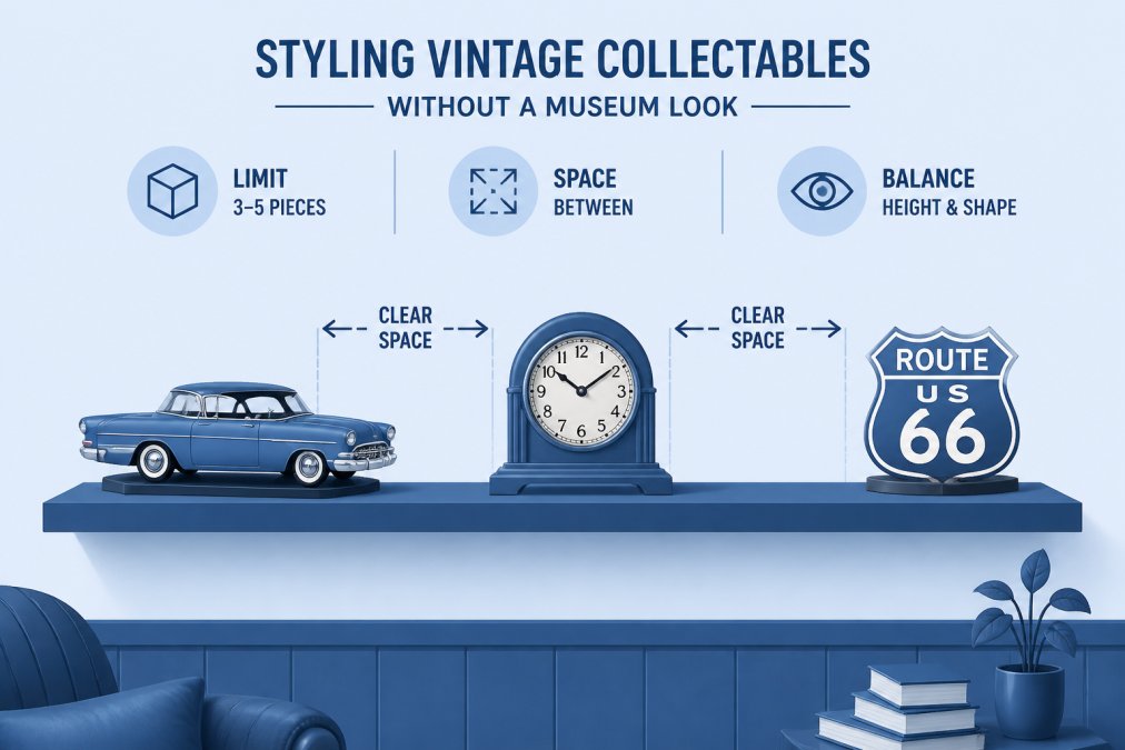
Neutral backdrops do most of the heavy lifting here. A plain wall, a simple timber shelf or a matte painted cabinet lets colour and texture in the objects do the talking. Busy wallpaper behind busy collectables creates the exact visual noise you're trying to avoid.
Building Vignettes That Breathe
A vignette is a small, self-contained display grouping that tells one visual story. Building vignettes that breathe means leaving deliberate gaps between objects so the eye can rest.
Try this structure for any shelf or side table:
- One anchor piece, such as a Vintage Clocks/Wall Decor piece, sets the theme.
- One supporting object at a different height, like a model or small sign.
- One texture element, such as aged metal or timber, to add warmth.
- Clear space around the group, roughly the width of your hand, on at least two sides.
Grouping items for display this way creates a collected look rather than a scattered one. It also makes rotation easy: swap the supporting object each season and the vignette feels new.

Balancing Vintage and Modern Decor in the Same Room
Balancing vintage and modern decor in the same room works best when one style leads and the other accents. Trying to give both equal visual weight creates tension that reads as clutter, even when the room is tidy.
A practical split is roughly 70/30 (peer-reviewed research). Let retro pieces carry the character, then ground them with contemporary elements: a plain modern sofa, a simple lamp, a clean-lined shelf. The contrast makes the vintage items look deliberate rather than dated.
There's a psychological layer here that most styling guides skip. Retro clutter doesn't just look busy, it can feel busy. Nostalgic objects carry emotional weight, and a room full of them can leave you feeling anchored to the past rather than comfortable in the present. Mixing in contemporary pieces gives the eye somewhere neutral to land, which is why a harmonious room almost always has a modern element holding it together.
If you're working with a specific theme, curated collections make this easier. A Mopar Wall Hanging or a Route 66 Wall Hanging gives a garage or den an instant focal point, and one strong piece needs far less surrounding decoration than five weaker ones.

Colour, Scale and Negative Space: The Rules That Do the Work
Colour, scale and negative space are the three levers that make or break a retro display. Get them right and almost any collection looks intentional. Get them wrong and even a small collection looks chaotic. What most guides skip is that retro decor has its own era-specific palette logic, and applying generic modern-minimalist rules to it flattens the character you collected the pieces for in the first place.
Palette simplification with era anchors
Choose a neutral backdrop, then limit your display to two or three accent colours drawn from the objects themselves. The shortcut is to anchor the palette to the era your collection leans into:
- Mid-century (roughly 1945-1969): warm walnut and teak tones, mustard, burnt orange, avocado green, cream, and brass or chrome accents.
- Space age and late-modern (roughly 1965-1979): white, black, primary red, and chrome, with one saturated pop colour.
- Americana and roadside (roughly 1930-1965): cream, deep red, navy, and weathered metal, with enamel signage whites as the neutral.
Pick one era as the lead palette and let a second era appear only in small objects. Two full era palettes fighting across a shelf is the single most common cause of a retro room reading as cluttered even when it is tidy.
Scale and proportion: the visual-weight test
A large sign on a small shelf overwhelms everything near it. Pair objects of similar visual weight, and use asymmetry rather than perfect symmetry to keep the arrangement from feeling stiff. A practical test: step back three paces and squint. If one object dominates the shelf to the point where you cannot describe the others, it is either on the wrong surface or needs more empty space around it.
A workable ratio for most shelves is one large piece to two or three small ones, with the large piece placed off-centre rather than dead middle. Dead-centre placement reads as a shrine; off-centre placement reads as a collection.
Negative space: the lever people skip
Negative space is the empty area around and between objects, and it is what separates a curated look from a crowded one. Aim for roughly a third of any display surface to stay empty. On a wall, that translates to leaving at least a hand's width of plain wall between framed or mounted pieces, closer than that and the eye reads them as one cluttered mass rather than separate objects.
| Problem | Fix | Why It Works |
|---|---|---|
| Too many small items | Group into threes, store the rest | Reduces visual weight |
| Clashing colours | Anchor to one era palette, limit to 2-3 accent tones | Creates cohesion |
| Everything same height | Vary heights across the shelf | Adds rhythm |
| No focal point | Add one statement piece, placed off-centre | Gives the eye an anchor |
| Surface fully covered | Leave a third empty | Restores negative space |
| Two era palettes competing | Demote one era to small objects only | Stops visual noise |
Maintenance Routines and Budget Storage for Retro Collections
Most styling guides stop at the styled shelf. The gap none of them close is what happens in the six months after: dust, new finds, seasonal pieces and slow accumulation refill the space you cleared. Maintenance routines and budget storage are what keep a retro collection looking curated long after the initial styling, and they cost far less than most people assume.
A monthly maintenance routine that actually holds
A simple monthly routine covers most collections:
- Dust and inspect each displayed piece
- Remove anything that no longer fits the current arrangement
- Rotate one stored item in and one displayed item out
- Re-check that each surface still follows the 3-3-3 rule
- Wipe down glass, chrome and signage with a soft, dry microfibre cloth
- Check wall fixings and shelf brackets for movement
Two habits matter more than the rest. First, dust with a dry microfibre cloth rather than a damp one on painted or printed surfaces, moisture is what lifts flaking paint and dulls enamel signage. Second, keep displays out of direct sunlight where possible, because prolonged UV exposure fades painted finishes, decals and printed signage over time (si.edu). If a piece is genuinely irreplaceable, rotate it away from the brightest wall rather than leaving it there permanently.
A rotation system, not just a tidy-up
The single biggest reason retro collections re-clutter is that there is no plan for where outgoing pieces go. A rotation shelf, one clearly designated storage spot, even a single cupboard shelf, solves this. Every time a new piece comes in, one piece goes to the rotation shelf. Nothing new enters the display without something leaving it. This is the mechanism that stops the slow creep of accumulation that no amount of restyling fixes.
Budget-friendly storage that protects the pieces
Storage for retro collectables is less about aesthetics and more about protecting finishes, and the cheapest options are often the right ones:
- Clear stackable tubs with labelled lids for smaller collectables. Clear so you can see what you have without opening everything; labelled so rotation is quick.
- Acid-free tissue paper for wrapping painted, printed or metal pieces. Ordinary newspaper and some plastics can transfer oils or acids onto finishes over time.
- Silica gel sachets in sealed tubs to manage moisture, particularly in humid rooms or garages.
- Wall-mounted shelving in a garage or cupboard for larger pieces, keeping them accessible without cluttering living areas.
- Old wooden crates or sturdy cardboard boxes as a free alternative to bought tubs, line them with acid-free tissue and label the outside.
Store heavier items low and lighter items high, both for safety and because lifting a heavy piece down from a high shelf is how chips and cracks happen. For anything mounted on a wall, check fixings periodically, vintage signage and metal pieces are often heavier than they look, and plasterboard fixings in particular can loosen over time.
Conclusion: Curate, Don't Accumulate
The hardest part of retro decor isn't finding great pieces. It's deciding which ones stay on display and which ones rest. Every collection reaches a point where adding more subtracts from the room rather than adding to it, and recognising that moment is what separates a curated space from a cluttered one.
Lost America Cool Classic Collectables exists for collectors who want that balance. Our curated selection of vintage-inspired collectibles, from wall decor and clocks to classic Americana signage, is built around pieces that earn their place in a room. Browse the range at Vintage Wall Decor Set of 3, or explore the full collection and start building a display that breathes. Shop Now.

Frequently Asked Questions
What is the 3-5-7 rule in decorating?
The 3-5-7 rule is a styling guideline for grouping objects in odd numbers: three items for a small shelf, five for a sideboard, seven for a large console. Odd numbers stop the eye from pairing items into rigid symmetry and create a more relaxed, collected look. With retro decor it works well because you can mix a tall piece, a mid-height piece and a small piece in each group, which naturally varies height and visual weight without adding more clutter.
How do you style vintage items without making a room look messy?
Give every piece a defined home and leave gaps between groups. A neutral backdrop, such as a plain wall or a simple shelf, lets each item read as a statement piece rather than part of a pile. Rotate your collection rather than displaying everything at once, and keep horizontal surfaces like sideboards and coffee tables to one or two objects. If a piece has no clear spot, store it and bring it out later.
How can I mix retro decor with modern furniture effectively?
Let the modern pieces carry the structure and the retro pieces carry the character. Keep large furniture, such as a sofa or shelving unit, in clean contemporary lines and neutral tones, then add warmth and texture through vintage items: a wooden vintage trunk as a side table, a wall clock, or a small group of classic car models. Aim for roughly 70 per cent modern base and 30 per cent retro accents so the room feels grounded rather than themed.
What are the best ways to display collectables without creating visual clutter?
Group items by theme, colour or material, and cap each group at three to five pieces. Use vertical space, such as a wall hanging or a single shelf, instead of spreading items across every flat surface. Keep the space around each group empty, and choose one focal point per wall or zone. For example, a Mopar Wall Hanging at $50 can anchor a garage wall on its own, with a couple of small models placed nearby rather than a full row of memorabilia.