
Table of Contents
- What Counts as Authentic Vintage Bar Signs
- How to Display Vintage Metal Signs Without Clutter
- Vintage Bar Decor Ideas by Era and Theme
- Authenticating Signs: Patina, Provenance and Materials
- Avoiding Clutter With Vintage Home Decor
- Styling a Man Cave or Garage Bar
- Choosing the Right Size and Colour for Your Wall Space
- Frequently Asked Questions
Last Updated: September 17, 2026
What Counts as Authentic Vintage Bar Signs
Authentic vintage signs for home bars are original advertising pieces produced for breweries, distilleries, petrol brands and soft drink makers, typically between the 1930s and 1970s. They carry the wear of real use: faded inks, rusted edges, drill holes from old mounting points.
Original Pieces vs Reproduction Signs
Original signs were made for commercial display, not for collectors. They hung outside workshops, inside pubs and above garage counters, which is why so few survive in clean condition. That scarcity is exactly what drives the market.
How to Display Vintage Metal Signs Without Clutter
Display vintage metal signs by treating them as a single composition rather than a collection of individual objects. Group three to five pieces on one wall, keep consistent spacing, and leave the surrounding walls bare.
guidance on safe picture and wall fixture loads
Wall Mounting and Layout Basics
Start with the largest sign and build outward. Mount it at eye level, roughly 1.5 metres from the floor, then place smaller pieces around it in an odd-numbered cluster. Odd numbers read as intentional; even numbers often read as accidental.
- Use wall anchors rated for the weight of the sign plus a safety margin, not just the sign itself
- Space pieces 5 to 8 centimetres apart so each one reads clearly
- Keep the top edge of the cluster level where the pieces are similar in size
- Leave at least 40 centimetres of bare wall on either side of the group
Vintage Bar Decor Ideas by Era and Theme
Vintage bar decor ideas work best when you commit to a single era rather than mixing decades. A Prohibition-era corner and a 1950s diner corner can both look superb. Together, in one small room, they fight each other.
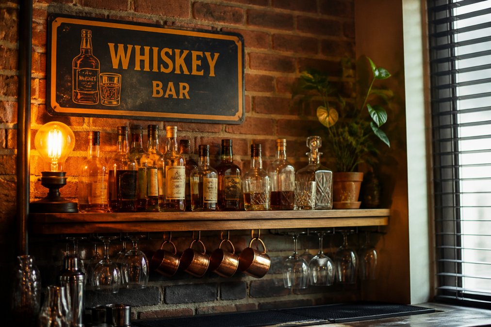
Prohibition-Era and Speakeasy Themes
Speakeasy styling leans on dark timber, low light and brass. Think hidden-door panelling, amber glass and signage that hints rather than announces. Deep greens, oxblood and near-black walls give the era its mood, and a single warm light source does more work than three bright ones.
Retro and Nostalgic Design Themes
The retro and nostalgic route is brighter and more playful. Petroliana, soft drink advertising and classic car memorabilia all sit comfortably here. A Hot Rod Neon Light at $50.00 adds colour without dominating a wall, and it suits a garage bar better than a formal lounge.

Authenticating Signs: Patina, Provenance and Materials
Most guides to vintage bar signs stop at 'buy what you love'. That advice is fine until you are standing in front of a piece priced as an original. Authentication rests on three things: patina, provenance and materials. Get all three aligned and you can buy with confidence. Get one wrong and you are paying original money for a decorative object.
Reading Patina Like a Collector
Genuine patina is uneven and directional. Rust gathers at edges, around mounting holes and along the bottom lip, because that is where moisture sat and where the metal was thinnest. Fading follows the direction of sunlight, so one side of a sign is often noticeably paler than the other. Scratches run in the direction of handling, not in random swirls.
A few field tests worth running before you commit:
- Tilt the sign under a raking light. Real patina has depth and sits in the metal; painted-on ageing sits on top.
- Look at the mounting holes. Original holes are usually worn oval or chipped at the rim from decades of hanging. Fresh, perfectly round holes on an 'old' sign are a warning.
- Smell the back. Genuine aged tin and enamel carry a dry, metallic, slightly musty scent. Freshly aged pieces often smell of paint, vinegar or solvent.
- Check the edges for a clean cut. Original signs were stamped or rolled; many reproductions are laser-cut with a uniform, sharp edge.
Materials and the Era They Belong To
Materials tell you whether a sign could plausibly have been made when the seller claims. The broad strokes:
- Tin and enamel: the dominant materials for brewery, soft drink and petrol advertising from the 1930s through the 1960s. Enamel signs have a glossy, glass-like surface; tin signs are lighter and more prone to rust-through.
- Heavier sheet metal: common for industrial, automotive and petrol branding, particularly from the 1940s onward. These pieces are heavier, stiffer and usually have folded or rolled edges.
- Timber: typically smaller, often hand-lettered or routed, and more common for pub, hotel and shop signage than for national brand advertising.
- Vinyl-backed aluminium and printed composite: a modern format. A sign described as '1940s' but printed on vinyl-backed aluminium is not a 1940s sign, regardless of the artwork.
Provenance: What to Ask and What to Accept
Provenance is the documented history of the piece. For most collectors, that means a paper trail: an auction record, a dealer's written description, a photograph of the sign in situ, or a documented collection it came from. Provenance does not have to be dramatic. A signed dealer invoice describing the piece as original is worth more than a verbal assurance.
- Where did this piece come from before you owned it?
- Do you describe it as original or as a reproduction, in writing?
- What is your return policy if an independent assessment disagrees?
Authentication is a three-legged stool: patina, provenance and materials. If any leg is missing, the price should reflect it.
Avoiding Clutter With Vintage Home Decor
Avoiding clutter with vintage home decor comes down to one principle: every piece needs a reason to be on that wall. Curation beats accumulation every time.
- Does it fit the era I have already committed to?
- Do I have a specific wall position for it?
- Does it add something the room does not already have?
Photograph your wall before you shop, then hold the photo next to a listing. It is far easier to spot a piece that will not fit your scheme on a phone screen than in a shop with good lighting.
Styling a Man Cave or Garage Bar
Styling a man cave or garage bar follows different rules to a lounge. These spaces are larger, rougher and often poorly lit, so signage needs to be bigger and bolder to register at all.
Choosing the Right Size and Colour for Your Wall Space
Size and colour should be chosen together, because a sign that is the right size but the wrong colour will still look wrong. This is where most home bar projects go sideways: the pieces are individually good, but the wall reads as a jumble because nothing was matched to the room's palette.
Sizing: Measure First, Buy Second
Start with the wall, not the sign. Measure the available width and height, then apply the two-thirds rule: your sign cluster should cover roughly two-thirds of the available wall width, leaving the rest bare. A cluster that fills the whole wall reads as clutter; one that fills a third reads as an afterthought.
A few sizing anchors that hold up in practice:
- Small den, under 3 metres wide: one large sign or a tight cluster of three small pieces. Anything more crowds the room.
- Standard lounge wall: three to five mixed sizes, with the largest piece roughly twice the height of the smallest.
- Large garage wall: one anchor piece at least 60 centimetres wide, plus a supporting cluster. Small signs disappear on a big wall.
- Feature bar corner: one statement piece. Resist the urge to add a second.
Colour Theory for Vintage Signage
The principle is contrast with restraint. A sign should either echo a colour already in the room or contrast with the wall behind it, not both, and not neither.
A simple framework:
- Dark walls (deep green, oxblood, near-black): warm, bright signage reads best. Reds, creams, yellows and aged whites pop against dark backgrounds without competing.
- Light walls (cream, off-white, pale grey): deeper tones hold their own. Navy, forest green, burgundy and black signage adds weight to a pale room.
- Strong accent colour already present: pick signs that echo the accent once and stay neutral elsewhere. Two competing accents fight each other.
- Neutral scheme: use signage as the colour source. One bold piece does more than three muted ones.
Matching Palette to Style
Colour choices should follow the era and style you have committed to, not the other way around.
- Industrial: black, rust, aged steel and off-white. Think petroliana, tool branding and workshop signage.
- Rustic: warm timber tones, deep green, cream and faded red. Timber signs and hand-lettered pieces suit this best.
- Mid-century modern: mustard, teal, orange and cream. Soft drink and petrol advertising from the 1950s and 1960s fits naturally.
- Speakeasy: oxblood, deep green, brass and near-black. Signage should hint rather than announce.
| Wall Type | Best Sign Scale | Colour Direction | Example Piece |
|---|---|---|---|
| Small den, under 3m wide | 1 large or 3 small | Warm tones on dark walls | Route 66 Wall Hanging |
| Standard lounge wall | 3 to 5 mixed sizes | Echo the accent once | Shelby Wall Hanging |
| Large garage wall | 1 anchor plus cluster | Bold, high contrast | Gasoline 3D Framed Art |
| Feature bar corner | 1 statement piece | Single strong hue | Vintage Aztec Slot Machine |
Australian Competition and Consumer Commission guidance on advertising claims

Frequently Asked Questions
How can you tell if a vintage bar sign is authentic?
Check the material, patina and mounting holes first. Original vintage bar signs are usually tin or heavy metal with genuine rust, faded paint and wear around the edges. Reproduction signs often have a uniform distressed finish and modern printing. Look for maker's marks, embossing and signs of age around screw holes. If the price seems low for a rare piece, treat it with caution and ask the seller about provenance before buying.
Are reproduction signs worth buying for a home bar?
Reproduction signs work well when you want a specific look without hunting for rare originals. They cost less, arrive in better condition and let you fill a large wall quickly. The trade-off is resale value and character, since reproductions rarely hold value the way authentic pieces do. Many collectors mix both, using originals as focal points and reproductions to build out the background. Match the finish to your existing decor so the mix looks intentional.
What materials were commonly used for authentic vintage bar signs?
Most original vintage bar signs were made from tin, stamped metal or wood, with some porcelain enamel pieces produced for breweries and soft drink brands. Tin signs were cheap to produce and easy to mount, which is why so many survived. Porcelain signs were heavier and more durable but cost more. Wooden signs were common for local pubs and personalised bar plaques. Knowing the material helps you date a piece and spot reproductions.
How do I style vintage signs in a small home bar without creating clutter?
Pick one focal sign and arrange smaller pieces around it rather than filling every gap. Group signs by theme, era or colour so the wall reads as a collection instead of a jumble. Leave breathing room between pieces, usually 5 to 10 centimetres, and keep shelf styling light. Rotate pieces seasonally instead of displaying everything at once. A tight, curated wall always looks better than a crowded one.
Where can I buy authentic vintage signs for home bars?
Specialist collectable stores, antique markets and curated online shops are the main sources. Ask about return policies and shipping times before you commit, especially for larger or fragile items. If you want a specific theme, such as classic car memorabilia, look for sellers who group items into curated collections.